
Wednesday, 18 December 2013
Target Audience: Rock Mood Board
Thursday, 28 November 2013
Primary Research Questionnaire
In order to carry out primary research and recieve direct information from the public, I have created a muisc magazine questionnaire, so I can figure out what the audience would like to see from a magazine. My questionnaire will be given to males and females of the ages 16-25 years old, I chose this specific age group due to the fact this age group are more interested in rock music (which is my selected genre for my music magazine). I can evidently see this from my secondary research analysis of Kerrang and NME, their reader profiles tell us that the average age of their target audience is 23 years old. I have decided to ask this age group what music genre is their favorite regardless of the fact I have already decided to focus my music magazine on rock music, because I want to find out how many people out of the 10 that I am going to ask will choose rock as their favoured genre, this will show me how strong the target audience truly is towards this specific genre. On my questionnaire I have decided to ask the public 10 questions so that I am able to gain almost all the information that I need in order to create my music magazine, also if I was to ask more than 10 questions many people would find it off putting and boring so wouldn't answer the questions effectively so my results would be invalid. The main aim of my questionnaire is to find out what my target audience really likes. I will record the data once it is all collected.
Music Magazine Questionnaire
1. What is your biological sex?
Male □ Female □
2. What is your most favoured genre of
music?
Rock □ Pop
□
Punk Rock □ Folk □
Indie □ House
Music □
Classical Rock □ Rave □
Opera □ Techno □
Rap □ Jazz □
Heavy metal □ Mowtown □
Hip hop
□ R&B
□
Others - please state
…………………………………………….
3. How often do you purchase a music
magazine?
Never □ monthly □
Weekly
□ Annually □
4. What price would you be willing to pay for
your music magazine?
0-49p □ £1.00-£1.99 □ £3.00-£3.99 □
50p-99p □ £2.00-£2.99 □ £4.00+ □
5. Which of the following artists/bands would you
want to read about in a music magazine?
Bring me the
horizon □
Artic
Monkeys □
System of
the down □
Paramore □
Kasabian □
You me at
six □
Blink 182 □
Others-
please state
6. What would you like to see featured in the
music magazine?
News updates
□ Surveys □ Reviews □
Interviews
□ Pictures □ Up and comings □
Gig guides
□ Poster □ Competitions □
7. Which of the following sections from a
contents page would encourage you to read a music magazine?
Regular’s □
Editor’s
Letter □
Reviews of
albums/downloads □
Interviews
with artists □
Features on
current bands □
Downloads □
Film/Television/Video
Game Reviews □
Live
Gigs/Festivals □
Others –
please state………………………………………………
8. Which of the following music magazines would
you read?
NME □
Q □
Uncut □
Kerrang □
9. Which of the following main images on the
cover would encourage you to buy a music magazine?
Male Artist
□
Female
Artist □
Female Group
□
Male Group □
Mixed Group □
10. Would you access websites or other media platforms
associated
with a music magazine?
Yes □
I decided to ask the question "how often do you purchase a music magazine" so that I know from my results wether to release my music magazines weekly, monthly or annually. Also it would give me an indication wether the public like to recieve information about music through magazines or from other sources such as the interenet seen as today's society is a lot more high tech. This would help me decide wether to put other incentives in the magazine such as posters, advertisements etc.
I asked the audience how much they would be willing to pay for a music magazine, this will give me an idea of what price range the audience will appreciate and think is a good value for money. I attend to initially set the price of my music magazine as the most popular price selected on my questionnaire, then later on when my magazine is established and I have a regular costumer fan base I will increase my profit by using a variety of pricing strategies.
I decided to ask the audience what existing music magazine would they read because this will give me an indication of what magazine presentation style my target audience would prefer to see included in my music magazine. This will then give me an idea of what layout is prefered.
Wednesday, 13 November 2013
School Magazine Front Cover: Analysis and Evaluation

The masthead of my magazine is "School Times". I chose this masthead because
it's got a similar sound to some popular magazines that already exits. I think
it's catchy and fits in well with the school genre and is straight the point,
telling the readers immediatley what the magazine is about to catch their
interest. I felt that my masthead could appeal to a variety of age groups and genders due to fact it's colours are neutral, were as colours like blue and green are normally assosiated with males and colours such as pink and purple are assosiated with females. I felt that this was a positive point, it meant that I could recieve a variety of readers, rather than just my target audience. So I would possibly recieve more profit for having a wider audience readership. Also I felt that the colour shceme of my masthead was a good choice because the title in red stands out on the black background and also
due to the fact red and black are well known colours in the magazine industry, so I believed that this masthead would work well. I also felt that the bold font helped the mathead stand out so that it was easily visible and that the capitals highlighted the importance of the magazine and its news. But over all I believe I could have developed further and produced a better masthead by maybe using a more appealing font and increasing the size even more so that it stood out over all other aspects on the page.

I felt that my main image was quite effective for my school magazine because it was a medium close up of the girl with just a plain background of a brick wall, this way we only focus
on the girl which is supposed to be the importance of the magazine so it fufils its purpose. But the brick wall still gives us an indication that we are on school premises.
I feel that it is simple yet very effective it allows the audience to pay
attention to what is needed. But the only negative point of my main image is that I didnt use any effects, I could of photo shopped the background out so that the main image dominates the front cover even more so than it does already. Also having a plain white background would make the school magazine look more clean and practical.
.jpg)
I think that my subsidiary images are effective for my school magazine because they are presented well and I feel that they have a good message behind them, they give the audience an indication of what news is being revealed in the magazine. I think that the composition of the subsidiary images is good but maybe could have been improved. Also I feel that the size of the subsidiary images are at an avaerage standard but maybe could have been enlarged a little so that the audience could see the images more clearly.
.jpg)
+-+Copy.jpg)
I feel that the colour of my splash is good because it fits the colour scheme which is yellow, red, black and white which are the tradditional well know colours in the magazine industry, so this means that the colour is effective. I think that the splash is good because it is bright and intense compared to the mathead making it stand out. Also I feel that the capitals make the splash stand out when looking at the cover of the school magazine and also highlights the importance it has on the front cover. The only negative point about the splash is it's fonts shape and size, I feel that I could've chosen a more appealing font and I could've enlarged the font size a bit more.
Over all I feel that the front cover of my magazine could have been improved in a variety of ways such as adjusting the mathead, the splash, the compisition of the main image, the pug and giving attention to details like the price, date, website and barcode.
Monday, 4 November 2013
What I have learnt about music magazines from my research
From my music magazine research, I have learnt that to have a successful music magazine the layout for most pages must follow a grid like structure. Also I have learnt that you must have a strict colour scheme that is present throughout the whole magazine, on every page. I now know that the most successful colours used in magazines are mainly red, black and white and sometimes yellow. I evidently saw this when analysing the colour scheme of all the sucessful magazines already established in the media industry that have a big fan base, so clearly these colours have an impact on the audience by catching their eye for various reasons. I have learnt that the magazine must be designed in a way that makes the reader curious and it must be designed so that the reader wants more. The layout of the magazine has to be set out in a simple way so it is clear for the reader to understand, the idea has to be unique but not too complex. It has to look just like any other magazine but with specific aspects creative and unique in comparison to competitive music magazines, so that it gains more audience readership. I have learnt a variety of facts about the music magazines front covers, contents pages and articles:
Front Covers -
- The masthead of the music magazine must fit in with the genre. It must be catchy and memorable so that it attracts customers and so that the audience remember the music magazines name rather than remebering other competing music magazines. The masthead must be the biggest text on the page, it must have the biggest size font in comparison to other writing on the front cover so that it stands out immediately.
- The main image is very important for attracting readers, it needs to dominate the whole of the front cover. The purpose of the main image is to represent the splash e.g if the splash was the name of the band "paramore" then the main image must be of the band as a whole or an idividual photo of one of the members, which I can see from my research most of the time is the main singer. So the main image must have a story behind it.
- The masthead, splash and main image must be effective to make the cover look interesting which is a must.
- The sell lines don't need to be very detailed, it is best if they are short and straight to the point telling the readers what news will be revealed inside the magazine.
- A header bar and footer line can make the magazine more detailed and its allows the magazine to give straight to the point infromation but they aren't always needed.
- There is always a barcode, issue date, price etc. on a music magazines front cover.
- The subsidiary images can't over come the importance and focus of the main image, they let the readers know what other bands are included in the magazine. Too many subsidiary images can make the front cover look messy but in some cases this has a postive effect but it depends on your target audience e.g kerrang's target audience which are young and prodominantly males like that messy look whereas Q's target audience like a clean, fresh look.
- The colour scheme is important it helps attract new readers.
Contents Page
- The contents page must follow a grid like structure putting it's information into columns, which makes the page look more practical and tidy. The majority of contents pages are on double page spreads.
- The purpose of the contents page is to tell the audience about what information will be given to them on each page in the magazine e.g it informs the reader about what artists are being interviewed and tells them what page to look at to recieve this specific information.
- The information is straight to the point, there isn't much detailed unless needed.
- Images are used on the contents page to attract readers and to give them evidence about what artists are being interviewed in the magazine. The images of the artists make the audience/fans feel that the news being revealed is reaslitic and true, it makes them feel closer to them. Images are also used on the contents page to make it look more attractive, so that its not just columns of writing which can make the page look boring.
- The colour scheme of the contents page must match the colour scheme of the front cover, it give the magazine a sense of identy.
- The masthead of the music magazine must be present somewhere on the contents page because it is the magazines indentity.
- The font must be different for each section of information, the font must vary according to shape, colour and size. Normally the headings are in bold and have a bright colour compared to the rest of the text.
- The article must also follow a grid like structure, the article is written in columns so that it is tidy. If an article looks messy, with information placed all over the page and if it isn't in a structure, it can make the audience not want to read the article. It can be very off putting. It is important to have a structured article so that it is easy to read.
- The majority of the articles in a music magazine have a main image, which most of the time is on one side of the double page spread.
- The colour scheme of the article must match the colour scheme of the front cover and contents page, this shows that the same colour scheme must be used throught the entire magazine, it is important to give a sense of indenty and also it attracts readers and allows specific information to stand out on the page, such as the main heading of the article and a pull quote from the interview.
- The font used in the article stays the same throughout the page and it is always smaller than the heading and the pull quote.
Music Magazine: Article Analysis
I am going to analyse the following music magazine articles for my reasearch. I think that these articles are very useful for my research they allow me to identify in advance what articles work well and what articles do not. They help to develop my ideas for my future production of creating my own double page spread article, they allow me to identify techniques such as the layout so I can successfully set out my own realistic article.

The first music magazine article I have decided to analyse is an article from Q magazine, informing the reader information about the band "My Chemical Romance." The article is an interview of the band telling the reader about their brand new album. The article gives facts to the reader about their album such as when it will be released, the album title, the song titles and where the album was produced. The page is split into two main sections, with the main image of the band and their name stated in a bolding heading situated at the top half of the page and the information informed to the reader is situated in columns at the bottom half of the page. The layout is very effect and isn't confusing for the reader to understand what text comes next, the information is placed in simple columns. The main image of this article dominates the page showing the reader immediately from a quick glance that this article is about the band "My chemical romance." The image shows the reader, if they're not a fan, what type of music the band play due to to the fact they have a reblious fashion sense and wild hair styles. There is a red bold heading situated in the centre of the bottom half, it is an important quote throughout the article said by one of the members of the band. The quote sums up what type of interview the article is about, it suggests that the interview is very informal and unprofessional due to the fact it is ofensive to other people and it implies that they think someone is promiscuous. The colour scheme of the article is red, black and white which matches the front cover colour scheme for Q magazines. White is used as a background colour, red is used on headings to highlight important information in the article and the font colour of the main body text is black which stand out on the white background. The information in the article is put into paragraphs to show the reader that there are many topics, this way the article doesn't look boring to the reader it looks more appealing.

The second music magazine article I have decided to analyse is an article from NME magazine, informing the reader information about the band "Green Day." The article is a review of Green Day's new album. The main image of the band shows the reader how many members there are. It also shows the reader what type of people they are by their dramatic eyemakeup and wild hair styles, it shows that they are reblious and don't care what effect they have on the audience. They don't care about being a rolemodel. They look like sterotypical rock stars full of self importance and ignoring all the rules, they look as if they are peering over somewhere they shouldnt be. The gaze of the band is straight at the audience this suggests that they are trying to connent to the reader enticing them in, their facial expressions are very harsh which makes the audience curious about what the article is about. The photo of the band shows the reader that their image is about looking cool. The layout of the article is straight forward and similar to most articles, the information is placed neatly into three main columns. There are 7 bold sideheadings with the font in red, each sideheading is a name of a song on their new album with information about that specific song stated underneath the heading, this immediately shows the reader that the articles is a review and is going to give facts about the songs on their new album. The colour scheme of the article is red, black and white which matches the colour scheme on the front cover of NME magazines. White is used as a background colour, red is used on headings to highlight important information in the article and the font colour of the main body text is black which stand out on the white background. Just like the first article I have analysed the information in the article is put into paragraphs to show the reader that there are many topics, this way the article doesn't look boring to the reader it looks more appealing.

The third music magazine article I have decided to analyse is a double page spread from a Kerrang! magazine. The article gives the reader information about Taylor Momsen, the lead singer of "The Pretty Reckless." The article focuses on her sudden career change from being an actor to a singer, we can see this in the pull quote that says "since she decided to swap the screen for the stage." The article interviews Taylor about her life. The first side of the two page spread is dominated by the main image of Taylor. The main image shows the reader what type of person Taylor is at the moment, it shows us that she is provocative and her image suits the caption "Wild Child." The gaze of Taylor is straight at the audience almost in a seductive way. The layout of the article is similar to the two other articles I have analysed it follows the same structure with the information placed neatley into columns. The colour scheme of this article is mainly red and black but it also has white text for the main heading and pull quote, which makes them stand out straight away with the black background. Just like the two other articles I have analysed, the information in this article is put into paragraphs to show the reader that there are many topics, this way the article doesn't look boring to the reader it looks more appealing.
Sunday, 3 November 2013
Friday, 1 November 2013
Music magazine: front cover analysis
The following front covers of music magazines are the one's I have chosen to analyse for my music magazine research. I hope to gain idea's from this analysis to include in my final music magazine cover. I will take positive aspects of the front covers to help develop my own and I will avoid negative aspects that do not work.

The first front cover I have chosen to analyse is a kerrang music magazine with the main splash as Paramore and the main image is of Hayley Williams the lead singer of the band. Kerrang! is owned by Emap publications who also own Q, Mojo and Empire magazine. Kerrang! was designed to focus primarily on heavy metal/rock music. The kerrang! target audience is between 15 and 24 years old, with a gender split of 60% male and 40% female.
Kerrang! magazines follow a standard magazine layout with a grid like structure, the layout offers snippets of text and a general approach to all essential areas of the genre, which works well for teenage readers who like to quickly read the latest information and not having to read a lot of text to know what the magazine offers.
The masthead of the magazine is covered slightly by the top of the main image this suggests that kerrang doesn't want it's readers to focus much on their masthead. They are a well known magazine so it is not needed, they are already established and have a loyal reading audience the main focus and importance of this magazine is the main story of Paramore. The masthead fits in well with the genre of the magazine the lettering is all sliced almost reflecting a reblious feel of the rock magazine.
The main image is an individual photo of the lead singer of Paramore rather than a group photo of the band this immediately suggests to the public that she is seen the most important to the media industry. She looks sterotypically like a rock singer and this sterotype has been constructed to the reader by a variety of ways. She is presented as being arrogant, sticking her fingers up to cause offence but she doesn't care what effect she has and she evidently doesn't care about being a rolemodel and showing a positive attitude. Her facial expression is also very harsh showing she is full of self importance and doesn't care what image she gives, her harsh facial expression and body language shows us that she is rebellious against the norms of society. It is seen as highly rude to give an agressive hand sign and not showing people respect. The gaze of Hayley Williams is straight at the audience but she isn't smiling so isn't completely inticing the reader in, instead she is pouting with attitude. She doesn't exactly look friendly but the reader might consider her as being very cool and attractive. Her clothing is a dark orange/red which matches the colour scheme of the magazine and so does her unatural dyed hair, also showing she is reblious and edgy trying unusual hair colour's which also reflect her rocky fashion style.
Kerrang! offers free posters which targets their teen audience, it allows fans to put posters up on their bedroom walls of their favourite "rock star". The subsidiary images of this kerrang! music magazine is the revealed posters that the magazine is offering, they are posters of the rock band "panic! at the disco." This band has the same aged fan base as the age readership of the magazine so not only does it help attract customers of the same age group to buy kerrang! but it advertises a well known rock band.
The colour scheme of the magazine is similar to most magazines, it has the tradittional magazine colours (red, black, and white), these colours make the magazine cover look more interesting to the audience and help certain stories stand out.
The sell lines of this kerrang! magazine are straight to the point and give limited information this helps make the reader curious about the news revealed beyond the front cover.

The second front cover I have decided to analyse is a Q music magazine with the main splash as Arctic Monkeys. Q magazine is sold throughout the UK and is owned by the Bauer
Media Group. Q magazine is aimed towards a 17- 30 year old target audience. Q music magazines mainly reveal new interviews of popular musical artist to their readership audience.
The masthead of Q magazine is placed in the left hand corner of all its magazines, it has an intense bright red background with white lettering overlapping, this immediately makes the magazine stand out. Just from looking at the masthead we can tell that this magazine is aimed at an older target audience/age group (up to 30 years old) compared to kerrang due to the fact it has a smart formal feel to the magazine. I think this is created by the use of the white background and having lighter colours, also the layout seems to be more planned and structured although it still follows a grid like structure as well as most magazines.
The main image is a group photo of the band "Arctic Monkeys." The main singer is positioned at the front of the image showing a leading role of the rock band, it shows us that he is in control. The gaze of the band is directly at the audience it's almost intimidating due to their harsh facial expressions. This this image helps reflect the pull quote "They're back with a bang" showing that they're back to go to the top almost as if they are prepared to fight for their title this is why their facial expressions are agressive.
The colour scheme of the magazine is red, black and white which makes everything important on the magazine stand out to the audience, we can evidently see that Q use the same colour scheme as kerrang! and many other music magazines.
The sell lines reveal a variety of news such as important quotes from compition bands such as the strokes, "They'd stab me to get to the top" it reveals how competetive these rock band are, they're rebellious and don't care what they do to get to the top.

The third front cover I have decided to analyse is a MOJO music magazine with the main splash as "The Beatles." MOJO magazine is owned by the Bauer Media Group as well as Q magazine. MOJO magazine is aimed towards a 30-60 year old target audience. MOJO mainly reaveals new interviews of popular musical artists just like Q magazine does.
The masthead of the magazine is in capitals and has white lettering making it immediately stand out on the black background of the front cover. The masthead is being slightly covered by the top of the main image, the O and the J are not seen to the audience but this shows us that the main focus of the front cover is Paul McCartney and that he is in control.
The main image dominates the page, it is of Paul McCartney in the foreground of the magazine and the other members of the band "The Beatles" are in the background, this suggests that he is highly important and is a leader character of the band. Paul McCartney's facial expressions is kind of iviting offering information for the reader to buy the magazine and read their article, almost as if he's smug of what information he is about to reveal.
The main sell line of the magazine is "How I survived the beatles" this quote makes the reader interested in what the article is about. It is used to try and persuade readers/fans to buy the magazine.
There are two subsidiary images on the front cover of MOJO unlike Q magazine who doesn't have any. The subsidiary images are of Bob Marley and Brian Wilson this helps attract a range of readers rather than just "The Beatles" fans. Unlike Q the front cover of this magazine contains a pug, offering readers a "free CD" this helps to catch the customers eye and persuade them to buy the magazine seen as they get extra beneifts of purchasing it.
The colour scheme of this MOJO magazine is also red, black and white just like Kerrang! and Q magazines.
The design and layot of this front cover is very formal and structured evidently aiming at a older target audience due to the fact it is more smart and organised. The layout of this magazine also follows a grid like structure just like Kerrang! and Q magazines.
The design and layot of this front cover is very formal and structured evidently aiming at a older target audience due to the fact it is more smart and organised. The layout of this magazine also follows a grid like structure just like Kerrang! and Q magazines.
Saturday, 19 October 2013
Final front cover

I have now added my splash and pull quote. I have kept the font colour of my splash the same as my original drawn draft because I feel that the yellow stands out a lot because the rest of my colour scheme is mainly red, black and white accept for my pug which is also yellow. I have decided to use a black frame around both of my subsidiary images because I think that it draws more attention to them and makes them look more formal and fancy. But I decided to use black frame's instead of a brighter colour so that they wouldn't stand out more than the main focuses (main image, masthead and splash). I have changed the font colour of my sell lines to white because I felt that the magazine had too many dark colours so I wanted to brighten it up a bit. I have also adjusted the main image so that the top of it is pulled closer to my masthead, I did this because I thought that the gap in between didn't look right and made the magazine look more plain and white.
Wednesday, 16 October 2013
School magazine cover - progress

This is my first attempt of creating the front cover of my school magazine. I have decided to keep the brick background of my main image because I thought that it made the magazine more interesting and less boring rather than having a plain coloured background. I also thought it was a good idea to keep the bricks as my background because I think that you can immediately identify the fact it is a school magazine straight away without even reading the masthead due to the fact the bricks give a school like feeling. I have decided to change the positioning of my sell lines on my school magazine in comparison to my first draft I had drawn because I thought they worked more effectively and fitted better this way without leaving too many spaces unlike my first draft. I have also decided to change the font colour on my header bar and footer line because I thought that the white stood out more rather than the black because the background of my masthead and sell lines are black also. I have also decided to get rid of one of my sell lines due to the fact I didn't want my front cover to be crammed with unneeded information. I think the students will read the front cover more when there is less sell lines to read, I believe they would be put of the magazine straight away if there was so much to read to start, also I think the smaller the information you give on the front cover the more interested they'll be to find out what news is inside. So I decided to use the most important sell lines to influence students to want to buy the magazine, there no point in putting boring sell lines on the front cover that will put readers off.

Next I added my subsidiary images to my front magazine cover but I decided to place them at the bottom rather than at the top by my main image because I thought that it was too crammed and was overlapping my main image which took away the attraction and importance of it. I think that having my subsidiary images at the bottom left hand corner of my magazine is more effective because its more spacious.
Tuesday, 15 October 2013
Options for my subsidiary images
I wanted my subsidiary images to link in with my splash and main image. I thought it would be nice to reveal to the reader the importance of that story. So I took a variety of photos for my subsidiary images so that I could choose the two images that are the most effective and my over all favourites.
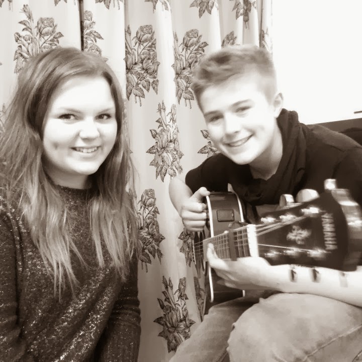
The first photo I took was a medium shot of the double act whilst they were practising, I thought that this shot would give the reader a chance to make a first impression of the double act. I thought that it was a good idea to take the photo whilst they were practising so that they were in and informal atmosphere so that it could show who they truly are through the photo. Also it helps show the reader that the double act are just ordinary teenagers like themselves making the reader more interested about a story related to their age group. But I decided not to use this photo for one of my subsidiary images because one I didn't realise at the time that I took the photo that it was a tad blurry. Also I decided not to use this photo because my main image is taken of the female singer in the double act that is currently a student at King Henry so is already recognised by many students in the school due to the fact she is talented and has be involved in school productions, so I decided to take one of my subsidiary images of just the boy (guitarist) in the double act. This way I thought the readers could make an impression of him and see his style, emotion and attitude through the camera.

The second photo I took was a long shot of the guitarist holding his guitar so that straight away we could see what instrument he played. Also I decided to take a long shot so that we could see his body fully, so that we could see his style and body language so that the audience could make their first impression of the boy. But I then decided not to use this photo because I realised that the photo is taken to far a way for us to see the boys facial expression, so we cannot see his emotion and attitude in the photo.

The third photo I took is a medium shot of the boy, I think that this photo option is a lot better than the other photo that I had taken of him individually because you can see his face close up and the audience are able to see his emotions, due to the fact he has a big smile. But also this photo allows us to his instrument, style, attitude and body language so I have decided to use this image for one of my subsidiary images. The photo shows us that he is happy and we can interperate that he is confident due to his laid back comfortable attitude towards performing.

I decided for my next subsidiary image to have some form of advertising to support "The Attix". This way the students that attend King Henry school would be aware of the double act, I thought that it was a good idea to support a talented member of our school. I decided to take a photo of their main promotion poster to help promote them to students so that they would get a wider audience. But I decided not to use this photo because it doesn't show anything about the double act and also it doesn't show how serious the double act are so it isn't an effective promotion.

Due to the fact the first promotion photo I took wasn't fully effective I decided to take a photo of a local news paper article that was based on "The Attix". I thought that this effectively shows the reader that the double act are serious about music and are recently a hot topic in the local area, making the reader want to know more about the double act seen as they are doing well.
Thursday, 10 October 2013
Main image (options)
On my front cover I wanted my main image to be the sixth form female student that is the lead singer of "The Attix" (acoustic double act) seen as it relates to my splash. I took a number of photos, with a variety of background so that i could choose the most effective image for the school magazine.

This was the first background option for my main image. I originally took this because I thought that a medium shot with a school sign behind the student would be effective giving the readers an immediate idea that the photo was taken on school premises, showing that it represents pupils and their school lives. But the only negative point I thought was that you couldn't see the student's emotion.

The second image I took had the same background. But i decided to get the student to pose with her hands on her hips to help reflect her personality and attitude. Also I tried to overcome the problems of the last image by taking the shot closer and focusing on the student more than the background, helping to show her emotions and making her the subject of the image due to the fact the splash is about her acoustic act. I think that it helps influence young pupils to read the magazine, creating a more casual atmosphere. I thought that having a older student would help attract a variety of ages to read the magazine. But I didnt think it was fully effective for the magazine.

The third image I took was a medium long shot of the student with the upper school foyer doors in the background. I decided to test out this shot beacuse I thought that as well as the the sign, the yellow in the background would help match the colour scheme of my magazine espeically due the fact the lettering of the splash has the exact same colours (yellow and black). Also I decided to take the photo of the upper school doors instead of the doors of lower school reception because the location of the sixth form resource area is here which relates to the student. But the only negative point like the first image I took is that you cannot see the student's emotion. Also I thought it could be considered as boring.

The fourth image I took was to try an give an impression of inside the school to the readers who do not attend King Henry. But this didnt work as no detail can be seen and again we are focusing on the background rather than the female student.

Lastly I decided to take a medium close up of the girl with just a plain background of a brick wall, this way we only focus on the girl which is supposed to be the importance of the magazine. But the brick wall still gives us an indication that we are on school premises. I feel that it is simple yet very effective it allows the audience to pay attention to what is needed.
Subscribe to:
Comments (Atom)