Saturday 19 October 2013

Final front cover


 I have now added my splash and pull quote. I have kept the font colour of my splash the same as my original drawn draft because I feel that the yellow stands out a lot because the rest of my colour scheme is mainly red, black and white accept for my pug which is also yellow. I have decided to use a black frame around both of my subsidiary images because I think that it draws more attention to them and makes them look more formal and fancy. But I decided to use black frame's instead of a brighter colour so that they wouldn't stand out more than the main focuses (main image, masthead and splash). I have changed the font colour of my sell lines to white because I felt that the magazine had too many dark colours so I wanted to brighten it up a bit. I have also adjusted the main image so that the top of it is pulled closer to my masthead, I did this because I thought that the gap in between didn't look right and made the magazine look more plain and white.

Wednesday 16 October 2013

School magazine cover - progress

 
This is my first attempt of creating the front cover of my school magazine. I have decided to keep the brick background of my main image because I thought that it made the magazine more interesting and less boring rather than having a plain coloured background. I also thought it was a good idea to keep the bricks as my background because I think that you can immediately identify the fact it is a school magazine straight away without even reading the masthead due to the fact the bricks give a school like feeling. I have decided to change the positioning of my sell lines on my school magazine in comparison to my first draft I had drawn because I thought they worked more effectively and fitted better this way without leaving too many spaces unlike my first draft. I have also decided to change  the font colour on my header bar and footer line because I thought that the white stood out more rather than the black because the background of my masthead and sell lines are black also. I have also decided to get rid of one of my sell lines due to the fact I didn't want my front cover to be crammed with unneeded information. I think the students will read the front cover more when there is less sell lines to read, I believe they would be put of the magazine straight away if there was so much to read to start, also I think the smaller the information you give on the front cover the more interested they'll be to find out what news is inside. So I decided to use the most important sell lines to influence students to want to buy the magazine, there no point in putting boring sell lines on the front cover that will put readers off.


Next I added my subsidiary images to my front magazine cover but I decided to place them at the bottom rather than at the top by my main image because I thought that it was too crammed and was overlapping my main image which took away the attraction and importance of it. I think that having my subsidiary images at the bottom left hand corner of my magazine is more effective because its more spacious.


Tuesday 15 October 2013

Options for my subsidiary images

I wanted my subsidiary images to link in with my splash and main image. I thought it would be nice to reveal to the reader the importance of that story. So I took a variety of photos for my subsidiary images so that I could choose the two images that are the most effective and my over all favourites.


The first photo I took was a medium shot of the double act whilst they were practising, I thought that this shot would give the reader a chance to make a first impression of the double act. I thought that it was a good idea to take the photo whilst they were practising so that they were in and informal atmosphere so that it could show who they truly are through the photo. Also it helps show the reader that the double act are just ordinary teenagers like themselves making the reader more interested about a story related to their age group. But I decided not to use this photo for one of my subsidiary images because one I didn't realise at the time that I took the photo that it was a tad blurry. Also I decided not to use this photo because my main image is taken of the female singer in the double act that is currently a student at King Henry so is already recognised by many students in the school due to the fact she is talented and has be involved in school productions, so I decided to take one of my subsidiary images of just the boy (guitarist) in the double act. This way I thought the readers could make an impression of him and see his style, emotion and attitude through the camera.


The second photo I took was a long shot of the guitarist holding his guitar so that straight away we could see what instrument he played. Also I decided to take a long shot so that we could see his body fully, so that we could see his style and body language so that the audience could make their first impression of the boy. But I then decided not to use this photo because I realised that the photo is taken to far a way for us to see the boys facial expression, so we cannot see his emotion and attitude in the photo.


The third photo I took is a medium shot of the boy, I think that this photo option is a lot better than the other photo that I had taken of him individually because you can see his face close up and the audience are able to see his emotions, due to the fact he has a big smile. But also this photo allows us to his instrument, style, attitude and body language so I have decided to use this image for one of my subsidiary images. The photo shows us that he is happy and we can interperate that he is confident due to his laid back comfortable attitude towards performing.


I decided for my next subsidiary image to have some form of advertising to support "The Attix". This way the students that attend King Henry school would be aware of the double act, I thought that it was a good idea to support a talented member of our school. I decided to take a photo of their main promotion poster to help promote them to students so that they would get a wider audience. But I decided not to use this photo because it doesn't show anything about the double act and also it doesn't show how serious the double act are so it isn't an effective promotion.
 
 
 Due to the fact the first promotion photo I took wasn't fully effective I decided to take a photo of a local news paper article that was based on "The Attix".  I thought that this effectively shows the reader that the double act are serious about music and are recently a hot topic in the local area, making the reader want to know more about the double act seen as they are doing well.

Thursday 10 October 2013

Main image (options)


On my front cover I wanted my main image to be the sixth form female student that is the lead singer of "The Attix" (acoustic double act) seen as it relates to my splash. I took a number of photos, with a variety of background so that i could choose the most effective image for the school magazine.

 
This was the first background option for my main image. I originally took this because I thought that a medium shot with a school sign behind the student would be effective giving the readers an immediate idea that the photo was taken on school premises, showing that it represents pupils and their school lives. But the only negative point I thought was that you couldn't see the student's emotion.
 

The second image I took had the same background. But i decided to get the student to pose with her hands on her hips to help reflect her personality and attitude. Also I tried to overcome the problems of the last image by taking the shot closer and focusing on the student more than the background, helping to show her emotions and making her the subject of the image due to the fact the splash is about her acoustic act. I think that it helps influence young pupils to read the magazine, creating a more casual atmosphere. I thought that having a older student would  help attract a variety of ages to read the magazine. But I didnt think it was fully effective for the magazine.


The third image I took was a medium long shot of the student with the upper school foyer doors in the background. I decided to test out this shot beacuse I thought that as well as the the sign, the yellow in the background would help match the colour scheme of my magazine espeically due the fact the lettering of the splash has the exact same colours (yellow and black). Also I decided to take the photo of the upper school doors instead of the doors of lower school reception because the location of the sixth form resource area is here which relates to the student. But the only negative point like the first image I took is that you cannot see the student's emotion. Also I thought it could be considered as boring.


The fourth image I took was to try an give an impression of inside the school to the readers who do not attend King Henry. But this didnt work as no detail can be seen and again we are focusing on the background rather than the female student.


Lastly I decided to take a medium close up of the girl with just a plain background of a brick wall, this way we only focus on the girl which is supposed to be the importance of the magazine. But the brick wall still gives us an indication that we are on school premises. I feel that it is simple yet very effective it allows the audience to pay attention to what is needed.

Thursday 3 October 2013

School Magazine Front Cover - 1st draft

 
  I have designed two draft covers for my school magazine so that I can develop my ideas and decide what one I prefer to create and develop into my final cover. I came to a conclusion that I liked certain aspects of both drafts so I decided to combine both of them together to create my final draft cover that I could adjust and develop during the creation of it.

 
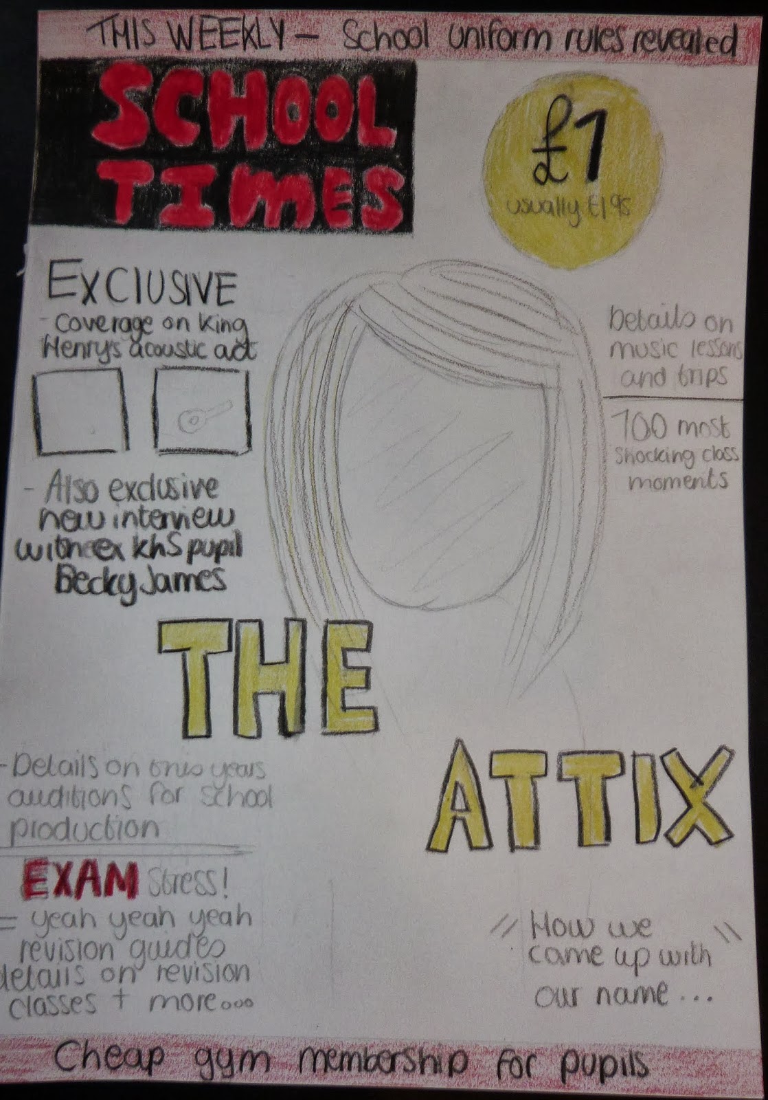
 This is my combined draft.I have decided to use the same masthead ,the same layout and the same splash as the left hand side draft. But I have swapped my main images around so that my final draft now has a female sixth former on the front cover. I have changed my pull quote completely to match the genre of my combined draft cover, so that it fits in with my splash better. I have mixed and matched some of the sell lines in my drafts to create better stories for the magazine becuase I thought that the left hand side draft was too much about music and the right hand side draft had too much leaking information about healthy eating and exercise. I chose the colour scheme of the front cover to be red, black, yellow and white seen as research had proven that this was the regular colour scheme for magazine covers.


The masthead of my magazine is "School Times". I chose this masthead because it's got a similar sound to some popular magazine that already exits. I think it's catchy and fits in well with the school genre and is straight the point, telling the readers immediatley what the magazine is about to catch their interest. I decided to have the title in red with a black background so that the masthead stands out and also due to the fact red and black are well known colours that work well on magazine covers. I want the font of my masthead to be bold and striking so that it catches many viewers attention and also so that it is easy to read. Also i decided to use capitals for my masthead so that it shows the importance of the information the magazine is going to give it's reader, it suggest it has top exciting news.
 

The pug I have designed is straight forward, its not very creative and doesnt have much infromation on it. I did this so that it would get the advertisement across and let the readers know that they are getting a better price than usual, which would help increase customers. I put the sign £1 in a bigger font and in bold so that the new price would be clearly evident and would easily catch their eye. The fact that its bold and in a bigger font in constrast to "usually £1.95" gives the reader the impression that it is a good discount and is important for the readers to know that the magazine have improved thier price. showing that they are loyal to their costumers wants. I chose the background colour of the pug to be yellow so that it would stand out and be in constrast to surrounding headings, such as the masthead and header bar which are in black and red.


 I chose to have a header bar so that it would reveal more information on the front cover, it has the advantage of containing infromation in a highlighted bar to show the importance of the news being given to the readers. Also header bars and footer lines are more likely to be to be read than sell lines, which are surrounded by loads of information. So i decided to put important information in my header bar, we all know that school uniform rules are formal and must be read to be able to follow. I decided to use the colours red and black so that it would stand out. Red symbolises danger, showing that school pupils will be in trouble if they dont follow the correct formal uniform rules. Also i used the reversed colours of the masthead (black background, red font) so that they would look good together. I put the words "this weekly" in capitals to emphasise the fact its updated information.


 The sell lines I have chosen have a variety of stories, to gain a mix target audience. The stories I have chosen on the front cover can appeal to many different types of people such as people who are interested in drama, sports, muisc and comedy. Also I decided to involve some important information such as exam techniques to infrom pupils that there will be help for them, so that some pupils will still apreciate reading a magazine in their free time when they could be studying because they are recieving advice. This will help gain a lot of customers. These stories are there to give hints to the reader which will make them more interested in reading the magazine. I have decided to have the font of the sell lines in black so that it doesnt overcome any other factors of the magazine such as the masthead and splash. I decided to use the colour red for the word "exam" to highlight the importance and so that it stands it in comparison to other sell lines.


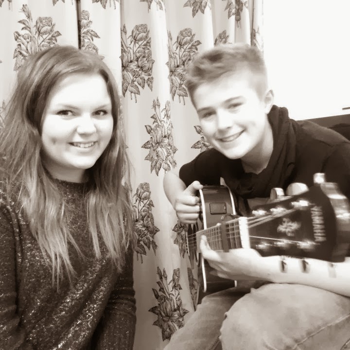
I chose the splash of my magazine to be called "The attix because its the acoustic double act that the magazine is interviewing. The singer attends King Henry's Sixth Form and I thought it would be interesting to have an interview on an aprecieted pupil for their talent. Also many pupils would be intreaged by this information if they are a music fan. The Attix are currently doing many local gigs which helps represents the school in the communitity. The font size is a lot bigger than other writing on the front cover because its the most important story revealed in the magazine. Also i decided to use capitals so that the splash would really stand out when looking at the cover of the school magazine. I used the colour yellow so that its bright and intense compared to the mathead. The splash of the school magazine also lead to development of the pull qoute "how we came up with our name" which gives the readers a hint of the facts revealed in their interview.
 

My main image links in with the splash of the magazine. It is a sixth form female that is the main singer of the acoustic double act. I have decided not to have the main image as a regular pupil in the school because it doesn't relate to the stories revealed.